A city in mist blue
01 — Design NotesToronto doesn't announce itself. It's a city of quiet grids and glass towers softened by lake fog rolling in off Ontario — which is exactly why we built the collection around mist blue instead of the postcard reds most Canadiana reaches for. It's the color of a September morning downtown, before the city fully wakes up.
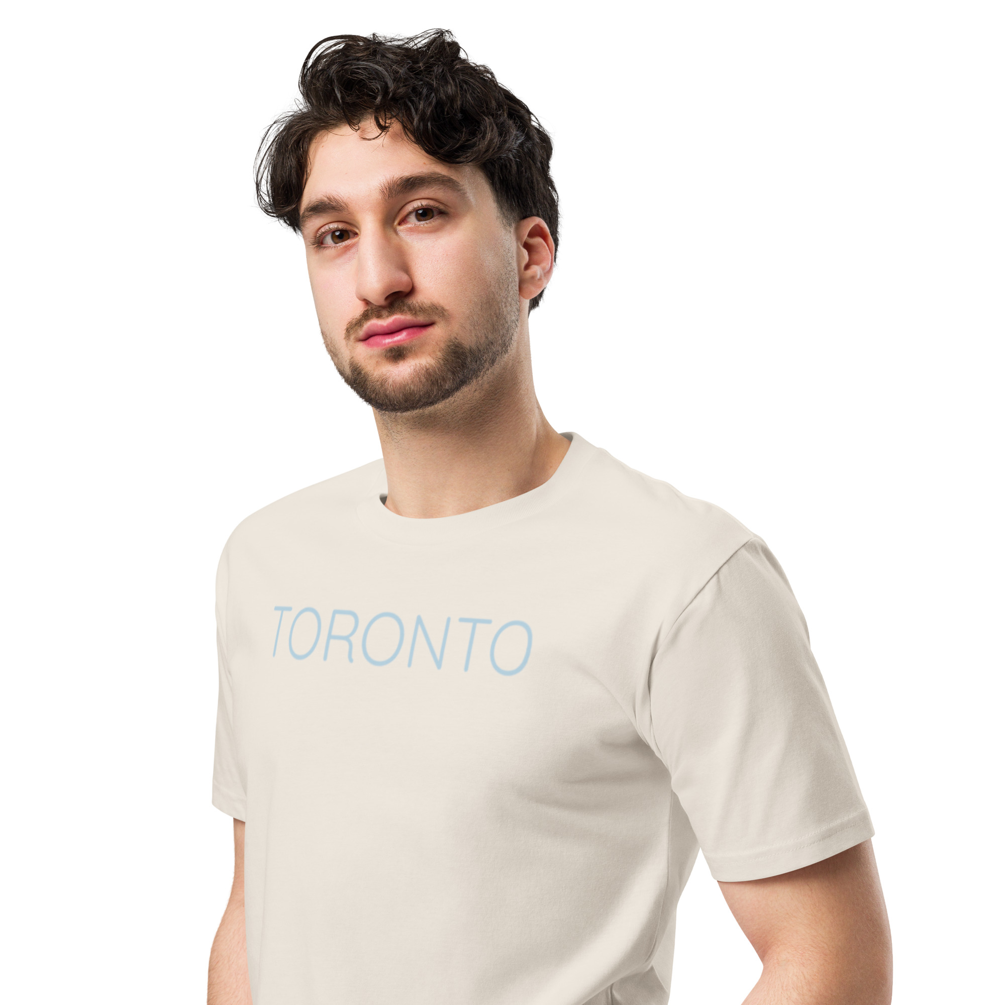
Every piece in the Toronto line starts from the same typographic mark: clean, condensed, closer to a transit map than a tourist tee. No skyline clichés, no maple leaf shorthand — just the city's name, set with the same restraint you'd want in the room it's worn in.
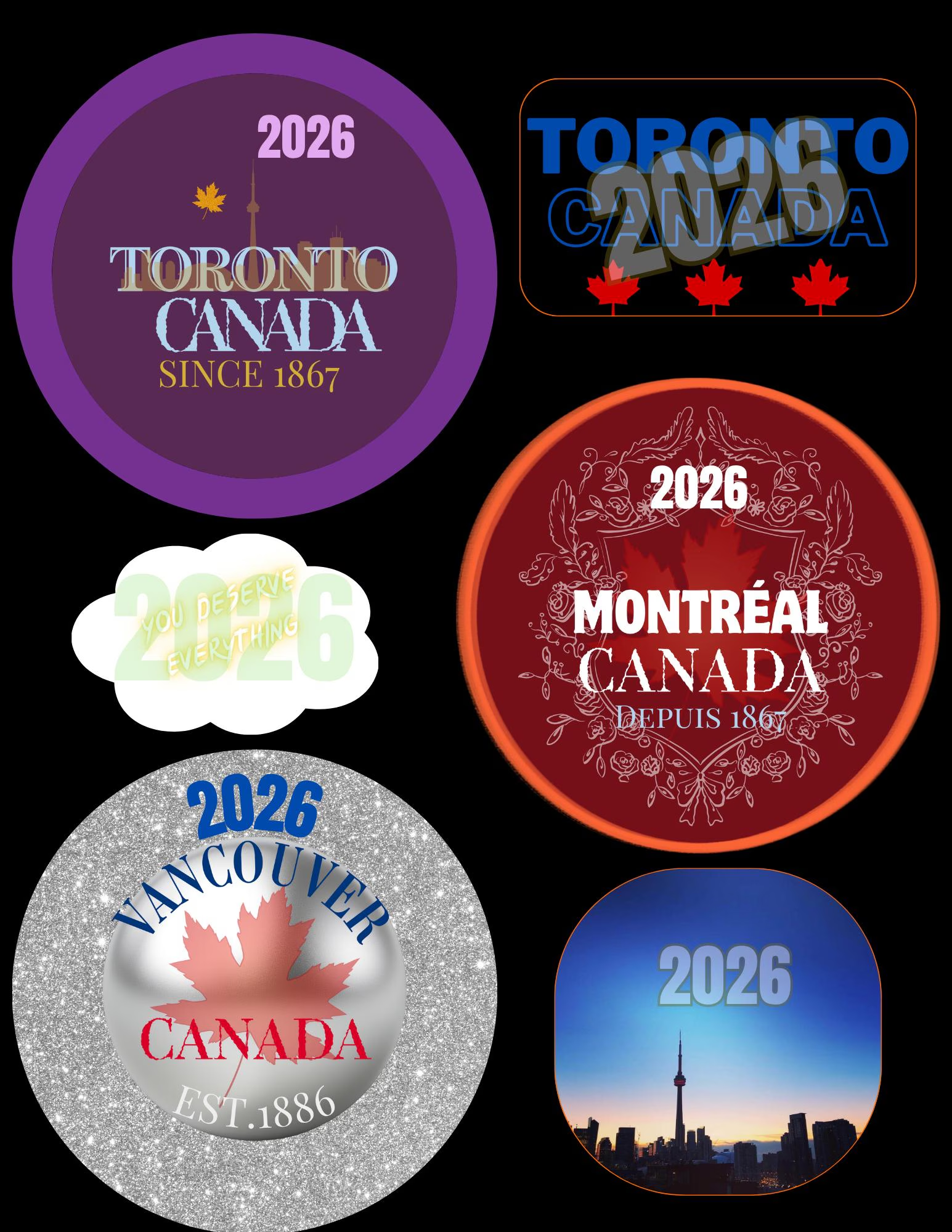
It's a small, deliberate line: a tee, a sticker, a badge. Each one is made to be given as easily as it's kept — a quiet way to hand someone a piece of a city that means something to you both.